
|
How to Add Color to Menu Definitions |
One easy way to update the appearance of a PxPlus application is to define the colors used on Menu Bars. Starting with PxPlus 2024, additional options for defining menu colors are available for both NOMADS and non-NOMADS applications.
For non-NOMADS applications, menus are created via the MENU_BAR directive. The MENU_BAR directive supports the use of parameters, such as LEFT, FILL, TEXT, etc., for defining colors in menus.
If the first character of the menu definition is an ! (exclamation point), or a first or second character of - (dash) is also specified, then the specified colors will also be applied to the top level menu (the horizontal menu at the top of the window). By default, the color will not apply to the top level menu.
Example:
This example creates a menu with a Dark Cyan background and White text:
menu_bar 10,"!LEFT(RGB:100,100,100),FILL(Dark Cyan),TEXT(RGB:255,255,255)[&File,&Edit,&Help],F:[&Open,&Save,&Quit],E:[&Add,&Delete],H:[&Version Info]"
See Menu Colors for more examples.
Colors can be applied to NOMADS menus and popup menus in four different ways. Click the link provided for each method for information on how to use it.
For information on their order of precedence, see Menu Color Hierarchy.
Sample Menu
To demonstrate all of these methods, the sample menu definition below will be used.
It contains the days of the week, which are defined as Menu Groups. Each day has three menu items: am, noon, pm. Simple code has also been added to each item to display a check mark beside the item if it is selected.
|
|
|
Since no menu colors have been assigned, the menu is using the default Light Gray background with Black text. When the mouse hovers over a selection, it is displayed with White text on a Blue background.
|
|
Method 1: Using NOMADS Global Variables or NOMADS Object Properties
Setting NOMADS global variables or NOMADS object properties may be the easiest way to define menu colors application wide. The ones that can be set to affect menu colors are:
|
Description |
NOMADS Global Variable |
NOMADS Object Property |
|
Menu Text Color |
%NOMAD_Menu_Text_Clr$ |
%NOMADS'Menu_Text_Clr$ |
|
Menu Text Background Color |
%NOMAD_Menu_TextBackground_Clr$ |
%NOMADS'Menu_TextBackground_Clr$ |
|
Menu Left Edge Color |
%NOMAD_Menu_LeftEdge_Clr$ |
%NOMADS'Menu_LeftEdge_Clr$ |
|
Use Menu Color on Top Level Option |
%NOMAD_Menu_Top_Option$ |
%NOMADS'Menu_Top_Option$ |
These settings are usually made in the Start_Up program or by using the NOMADS Environment Maintenance utility.
Example 1:
Adding the following lines to your Start_Up program would result in a menu with Blue text on a Yellow background and a Light Green left edge:
%NOMAD_Menu_Text_Clr$="Blue"
%NOMAD_Menu_TextBackground_Clr$="Yellow"
%NOMAD_Menu_LeftEdge_Clr$="Light Green"
%NOMAD_Menu_Top_Option$="Y"
Results in:
Example 2:
The NOMADS Environment Maintenance utility can be used to set the following Menu Bar properties that affect menu colors:
%NOMADS'Menu_LeftEdge_Clr$
%NOMADS'Menu_TextBackground_Clr$
%NOMADS'Menu_Text_Clr$
%NOMADS'Menu_Top_Option$
These steps show you how to use the NOMADS Environment Maintenance utility to set the Menu Bar properties:
|
1. |
From the IDE Main Launcher, invoke the NOMADS Environment Maintenance utility. See Invoking NOMADS Environment Maintenance. |
|
2. |
The Maintain NOMADS Environment window displays. Scroll down the list until Menu Bar is displayed in the Category column. You should see the four Menu Bar properties mentioned above. |
|
3. |
To set a Menu Bar color property, click the Color Selections (paint palette) button in the Value/Expression column. The Color Selections window displays. Select the color and click OK. |
|
4. |
You are returned to the Maintain NOMADS Environment window. The selected color displays in the Value/Expression column, and the check box in the Set column is automatically selected. A description of the selected property also displays below the grid. |
|
5. |
To set the Menu_Top_Option$ property, click the drop down arrow in the Value/Expression column and then choose a value. After that, the check box in the Set column is automatically selected. |
|
6. |
Click OK to save and exit the utility. |
Method 2: Applying a Menu Bar or Popup Menu Theme
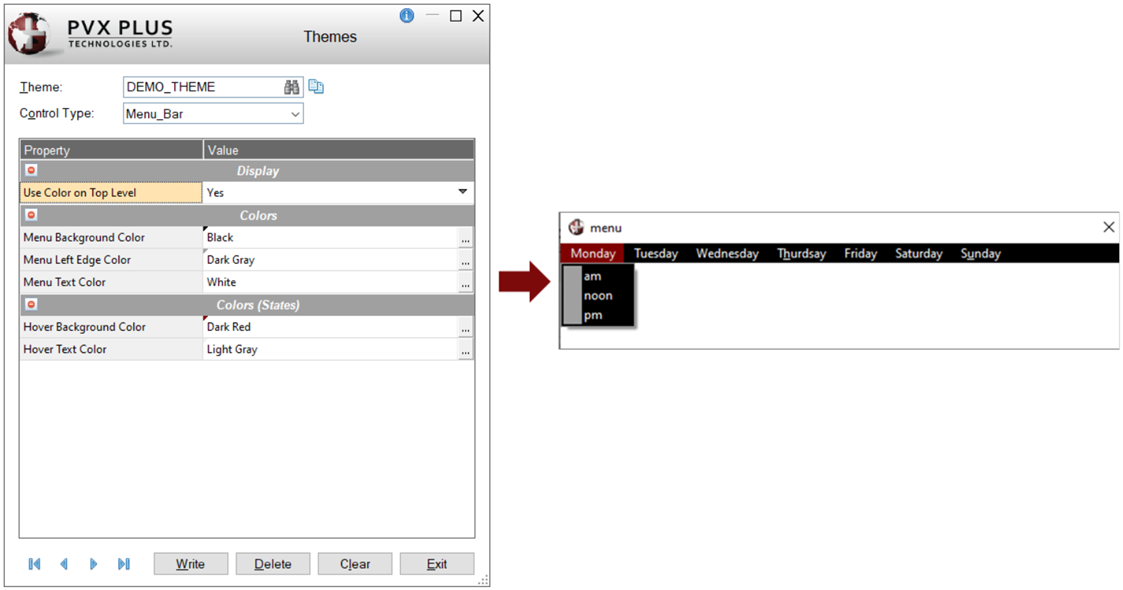
A Theme can be defined for Menu_Bar or Popup_Menu control types. Both have similar properties that can be defined; however, the Menu_Bar has one additional property, Use Color on Top Level property, which is not applicable to the Popup_Menu.
|
|
|
This example shows a Menu_Bar Theme definition and a sample menu with this Theme in effect:

These steps show you how to define a Menu_Bar Theme and then apply this Theme to a menu on a specific panel:
|
1. |
Invoke the Themes Maintenance utility. From the IDE Main Launcher, expand the Graphical Application Builder (NOMADS) category, and then expand the Setup category. Select Themes. |
|
2. |
If the Themes file does not exist, a message will display to ask if you want to create it. If this happens, click Yes. |
|
3. |
The Themes Maintenance utility is displayed. |
|
4. |
Enter a unique Theme name and then press the Tab key. |
|
5. |
For Control Type, select Menu_Bar from the drop down list. |
|
6. |
The grid lists the Menu_Bar properties. |
|
7. |
To set the Use Color on Top Level property, click the drop down arrow in the Value column, and then choose a value. |
|
8. |
To set each of the color properties, click the three-dotted button in the Value column. The Color Selections window displays. |
|
9. |
Select the color and then click OK. The selected color displays in the Value column. A small triangle shows a sample of this color in the upper left corner of the cell. |
|
10. |
When you are done setting the properties, click the Write button. |
|
11. |
A message displays to confirm that the Theme record was updated/added. |
|
12. |
A Theme can be applied at several hierarchical levels within an application. See Applying a Theme to Your Application. These next steps show you how to apply a Menu_Bar Theme to a menu on a specific panel. Launch Library Object Selection and, in the NOMADS Panel Designer, load the panel that contains the menu definition. |
|
13. |
On the panel menu bar, select Panel > Header to launch the Panel Definition. |
|
14. |
Click the Font/Color tab. |
|
15. |
Under the Theme section, click the drop down arrow on the input control and then select the Theme.
|
|
16. |
Click OK to save and close the Panel Definition. |
|
17. |
Test the panel. Assuming that no other colors are defined for the individual menu, the colors defined in the Menu_Bar Theme are applied. |
Method 3: Defining Menu Colors in Library Defaults
Menu colors can also be defined at the Library Defaults level for a specific screen library. Any menus defined for panels in the screen library or any popup menus defined for the library will use the Library Defaults colors unless a Theme is defined or colors are defined for a specific panel.
These steps show you how to define menu colors at the Library Defaults level:
|
1. |
Launch Library Object Selection for a specific screen library. |
|
2. |
Invoke the Library Defaults window. This can be done by using one of the following methods: Method 1: Select Library in the menu bar, and then select Library Defaults. OR Method 2: If using either Button View or Toolbar View (on the Views menu), click the Defaults button. |
|
3. |
On the Library Defaults window, select the Font/Color tab. |
|
4. |
Under the Menu Color section, change each of the following options by clicking the Color Selections (paint palette) button, which displays the Color Selections window: For Background, select Dark Magenta and then click OK. |
|
5. |
For the Apply Menu Colors to Top Menu option, click the drop down arrow and select Yes. |
|
6. |
The Menu Color selections look like this: |
|
7. |
Click OK to save and return to Library Object Selection. |
|
8. |
Test the panel. Assuming that no Theme is in effect and no colors are defined for an individual menu, the panel displays as follows: |
Method 4: Adding Colors to an Individual Panel Menu
These steps show you how to add colors to a menu on an individual panel:
|
1. |
In the NOMADS Panel Designer, load a panel that contains a menu definition. |
|
2. |
Invoke the Menu Bar Definition dialog. This can be done by using one of the following methods (depending on which Designer menu option is selected): Method 1: If using the NOMADS+ Toolbar, click the Menu button in the toolbar. OR Method 2: If using either the Folder Style or Property Sheets version of the Panel Designer, select Panel from the top menu bar and then select the Menus option. |
|
3. |
On the Menu Bar Definition dialog, click the Menu Colors button. When no colors have been defined, this button displays as shown below: |
|
4. |
The Define Menu Colors dialog displays. Initially, all of the inputs show the default values: |
|
5. |
Under the Menu Colors section, change each of the following options by clicking the Color Selections (paint palette) button, which displays the Color Selections window: For Text, select White and then click OK. |
|
6. |
The Menu Colors selections looks like this: |
|
7. |
Click OK to save and exit the Define Menu Colors dialog. |
|
8. |
You are returned to the Menu Bar Definition dialog. The Menu Colors button changes color and displays a green check mark to indicate that colors have been defined. |
|
9. |
Click the Save toolbar button and then close this dialog. You are returned to the Panel Designer. |
|
10. |
To see the result, test the panel. Notice that the menu colors are applied to the sub-menus only. |
|
11. |
Edit the menu definition so that the menu colors are applied to the top menu also. Invoke the Menu Bar Definition dialog again and click the Menu Colors button. Click the drop down arrow on the Apply Menu Colors to Top Menu option and then select Yes. |
|
12. |
Click OK to save and exit the Define Menu Colors dialog. |
|
13. |
You are returned to the Menu Bar Definition dialog. |
|
14. |
Click the Save toolbar button and then close this dialog. You are returned to the Panel Designer. |
|
15. |
To see the result, test the panel. Notice that the menu colors are applied to the top menu also.
|
|
16. |
This menu can be enhanced even further by adding a hover background color and a hover text color. This can be done by defining a Visual Class (or Theme) for the Menu_Bar control type to set the Hover Background Color and Hover Text Color properties. Invoke the Visual Classes Maintenance utility. From the IDE Main Launcher, expand the Graphical Application Builder (NOMADS) category, and then expand the Setup category. Select Visual Classes. Note: |
|
17. |
If the Visual Classes file does not exist, a message will display to ask if you want to create it. If this happens, click Yes. |
|
18. |
The Visual Classes Maintenance utility is displayed. |
|
19. |
Enter a unique Visual Class Name. For this example, enter MENU. |
|
20. |
For Control Type, select Menu_Bar from the drop down list, and then enter a Description (optional). The grid lists the Menu Bar properties. |
|
21. |
To set the Use Color on Top Level property, click the drop down arrow in the Value column, and then choose a value. For this example, select Yes. |
|
22. |
To set each of the color properties as shown below, click the three-dotted button in the Value column. The Color Selections window displays. |
|
23. |
Select the color and then click OK. The selected color displays in the Value column. A small triangle shows a sample of this color in the upper left corner of the cell. |
|
24. |
When done, click the Write button, and then the Exit button. |
|
25. |
In the NOMADS Panel Designer, load the same panel that contains the menu definition. |
|
26. |
Invoke the Menu Bar Definition dialog, and click the Menu Colors button. |
|
27. |
Under Visual Class, click the drop down arrow in the second input. Select the Visual Class you just created (MENU).
|
|
28. |
Click OK to save and exit the Define Menu Colors dialog. |
|
29. |
You are returned to the Menu Bar Definition dialog. |
|
30. |
Click the Save toolbar button and then close this dialog. You are returned to the Panel Designer. |
|
31. |
To see the result, test the panel. Notice the following: The selected colors for Hover Background Color and Hover Text Color are applied. The Blue colors selected for the Visual Class properties, Menu Background Color and Menu Left Edge Color, override the Green colors defined for the menu in Step 5.
|
Assigning Colors to Individual Menu Items
Using Menu Bar Definition, colors can also be assigned to individual menu items.
For this example, the sample menu above will be used to assign different colors to Saturday and Sunday in the top menu bar.
|
1. |
Invoke the Menu Bar Definition dialog for this menu. Double click on the &Saturday group in the list box on the right. |
|
2. |
The Menu Item/Group Definition dialog displays. Click the Attributes tab. Under the Item Colors section, the Background and/or Text colors for an individual menu item can be assigned. |
|
3. |
Click the Background drop down arrow and select Specify Color. |
|
4. |
Click the Color Selections (paint palette) button to display the Color Selections window. Select Light Yellow and then click OK. |
|
5. |
Click the Text drop down arrow and select Specify Color. |
|
6. |
Click the Color Selections (paint palette) button to display the Color Selections window. Select Black and then click OK. |
|
7. |
The colors for the &Saturday group are now defined. Click OK to save. |
|
8. |
You are returned to the Menu Bar Definition dialog. Double click on the S&unday group. |
|
9. |
The Menu Item/Group Definition dialog displays. Click the Attributes tab. |
|
10. |
Specify the same Background and Text colors for the S&unday group as you did for the &Saturday group. |
|
11. |
When done, click OK to save. You are returned to the Menu Bar Definition dialog. |
|
12. |
Next, assign Background and Text colors for each item under the &Saturday group. Click on the &Saturday group in the Groups tree view control on the left. The contents of this group are listed on the right. |
|
13. |
Double click on the first item under the &Saturday group. |
|
14. |
The Menu Item/Group Definition dialog displays. Click the Attributes tab. |
|
15. |
Assign the Background and Text colors for this item. Items on a menu can be assigned unique colors, if desired. For this example, the same colors as before will be used: Light Yellow for the Background color, and Black for the Text color. |
|
16. |
Double click on the second item under the &Saturday group. Specify the same Background and Text colors for this item. |
|
17. |
When you are done assigning colors for each item, click the Save toolbar button and then close this dialog. You are returned to the Panel Designer. |
|
18. |
To see the result, test the panel. Notice the assigned colors for Saturday and Sunday. |
%NOMADS Properties
NOMADS Environment Maintenance
Themes
Visual Classes
Menu_Bar Properties
Popup_Menu Properties
Menu Bar Definition
Creating a Menu Item and Group