|
Graphical Control Objects |
|
Graphical control objects are used in PxPlus applications to display information, input data, and handle event processing. These controls can be created by using specific directives (i.e. BUTTON directive, GRID directive, etc.) or by using NOMADS Panel Designer.
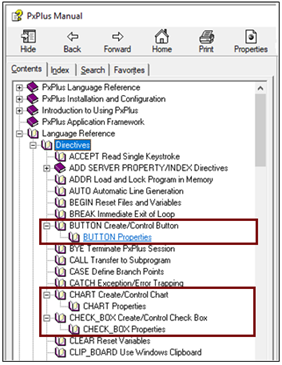
For each graphical control object, a list of properties and their descriptions is included with the Help for the associated control directive. For example, a list of Button Properties is available by expanding the Help node for the BUTTON directive. A list of Chart Properties is available by expanding the Help node for the CHART directive, and so on.
Use the links below to access a list of properties for each specified control type. For a list of all the properties on one page (in alphabetical order), see Properties List.
|
Control Type |
Description |
|
The button control is usually designed to send a signal to the application when selected by a mouse click. The signal typically indicates that the user wants to end a function or initiate a new function. | |
|
The chart control is used to create illustrations for an application. A chart is usually designed to be a display only object that requires no user interaction. | |
|
The check box control is designed to be toggled between two states: On to check the option or Off to uncheck it. | |
|
The drop box control is used to provide a drop-down list of elements from which users can make a selection. A drop box takes a smaller amount of space on the screen than a comparable list box. | |
|
The grid control is used to create a table of cells in columns and rows; i.e. a spreadsheet input format. See Grid Property Access, Multiple Selections, Drag and Drop and Loading/Accessing by Row. | |
|
The list box control displays a list of elements from which the users can make a selection. PxPlus supports different list box types: Standard, Formatted, List View, Report View and Tree View. See Multiple Selections and Load on Demand. | |
|
The list view list box control operates like a Standard list box but provides for columnar lists with optional bitmaps. The format appears similar to the right-side pane of "classic" Windows Explorer. See Multiple Selections and Load on Demand. | |
|
The multi-line control provides a standard input field to display and enter one or more lines of text. Rich Text Format word processor controls have additional control specific properties. See MULTI_LINE Rich Text Properties. | |
|
Radio button controls are used to control a variable between a series of pre-set states, offering one choice from a group of options. When one radio button is selected, it becomes activated (On) and all other related radio buttons are automatically reset (Off). | |
|
The report view list box displays multiple data elements in a tabular list with the use of headings and other attributes. | |
|
The horizontal scrollbar control is designed to create and manipulate a horizontal scrollbar on the screen. | |
|
The vertical scrollbar control is designed to create and manipulate a vertical scrollbar on the screen. | |
|
The tree view list box control operates like a Standard list box but appears as a tree-like structure with optional bitmaps. Each entry in a tree view consists of a series of strings or values separated by a delimiter like a directory structure. See State Indicators and Multiple Selections. | |
|
The tristate box control is a check box in which the user can toggle between three states: On, Off and a Third state. | |
|
The variable drop box control operates like a Standard drop box but will allow variable input, which means that the user can select any element from a list of items associated with the drop box but can also enter any other value. | |
|
The variable list box control operates like a Standard list box but will allow variable input, which means that the user can select any element from a list of items associated with the list box but can also enter any other value. |
Compound Properties
Color Properties
Creating Panel Controls (using NOMADS)