File Maintenance Generator

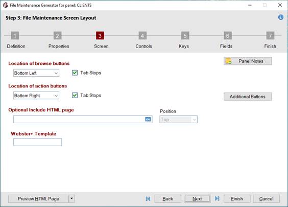
Step 3: File Maintenance Screen Layout

Define the options for screen positioning, browse and action buttons locations, and the panel header. Specify whether an optional Embedded Panel and/or HTML page will be included.

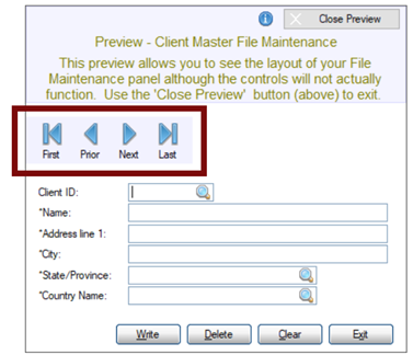
When only HTML Page is selected as the Form Type in Step 1: Definition, options that are not applicable are not displayed, as shown in the second screen shot:


When only "HTML Page" is selected

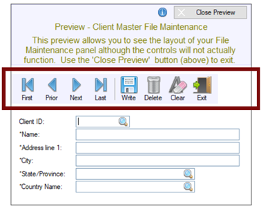
This panel consists of the following:

Define screen position

Define the options for screen position for the NOMADS panel. Click the Additional Options button for panel header options.

Position

(Applicable for NOMADS Panels Only)

Determines where the panel is placed on the desktop. NOMADS provides the capability for the system to remember where a panel was last placed and will attempt to restore it to the same position. See Panel Persistence.

Click the drop-down arrow for a list of selections:

Absolute

The panel will be positioned on the current monitor at the Column and Line specified. The current monitor will be the main monitor for the initial screen or the monitor in use if you currently have a panel/window being displayed.

Relative

(Default) The panel will be positioned using the Column and Line values as relative positions based on the current panel/window being displayed.

If no window is displayed, then the position will be relative top of the screen.

Note:
There is almost always a window logically present even if it is minimized, as PxPlus creates a main window during start up and preserves its last location automatically.

Centered

The panel is displayed as centered on the current display. Column and Line values are not applicable.

Column

(Applicable for NOMADS Panels Only - Available when Position is Absolute or Relative)

Starting vertical position for the top left corner of the generated panel. Valid values are 1 - 620. (Default is 5.)

(Support for increased Column maximum was added in PxPlus 2021.)

Line

(Applicable for NOMADS Panels Only - Available when Position is Absolute or Relative)

Starting horizontal position for the top left corner of the generated panel. Valid values are 1 - 255. (Default is 5.)

(Support for increased Line maximum was added in PxPlus 2021.)

Additional Options

(Applicable for NOMADS Panels Only)

Button that launches the Additional Options window with more options for defining the panel header.

Panel Notes

Button that is used to add notes/comments for the panel. Maximum 1024 characters. (Same as the Notes button in NOMADS Panel Definition.)

(The Panel Notes button was added in PxPlus 2022.)

Location of browse buttons

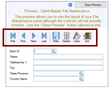
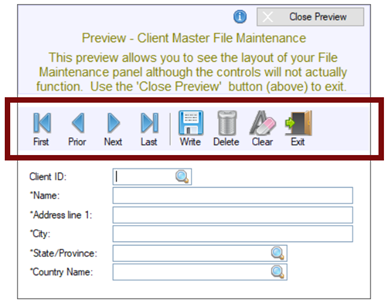
Specify the location of the browse buttons. Define any Additional Buttons to be added before and/or after the browse buttons.

(Location Drop Box)

Click the drop-down arrow for a list of locations.

If selecting a Location that is either identical to or conflicts with the location of the Action buttons, a message will display, in which case, select a different location.

For additional information, see Browse and Action Buttons in HTML Pages.

Bottom Left

(Default) Buttons are positioned horizontally in the bottom left corner of the main panel.

Bottom Right

Buttons are positioned horizontally in the bottom right corner of the main panel.

Top Left

Buttons are positioned horizontally in the top left corner of the main panel.

Top Right

Buttons are positioned horizontally in the top right corner of the main panel.

Beside Key

Buttons are positioned horizontally next to the primary Key field.

Beside Last Key Seg.

(Available when primary Key has more than one segment)

If the data dictionary table selected in Step 1: Definition has a primary Key with more than one segment, buttons will be positioned horizontally next to the last segment.

(The Beside Last Key Seg. option was added in PxPlus 2021.)

Toolbar

Fixed toolbar (i.e. does not stretch) comprised of individual button controls and is positioned at the top left of the main panel.

Example:


If Toolbar is selected for both the Browse and Action buttons, the toolbar will contain browse and action buttons.


(The Toolbar selection for browse buttons was added in PxPlus 2020.)

Embedded Panel

(Applicable for NOMADS Panels Only)

Select an existing embedded panel to use in place of the standard browse buttons.

The Library and embedded Panel name must be entered or selected; otherwise, a message will display.

Embedded Toolbar

(Applicable for NOMADS Panels Only)

Embedded toolbar that extends horizontally across the top of the main panel and contains embedded button controls.

Example:


If Embedded Toolbar is selected for both the Browse and Action buttons, the embedded toolbar will contain browse and action buttons.


(The Embedded Toolbar selection for browse buttons was added in PxPlus 2020.)

None

No browse buttons.

(The Toolbar and Embedded Toolbar selections were added in PxPlus 2020.)

Library

(Applicable for NOMADS Panels Only - Available when browse buttons Location is Embedded Panel)

Library path for the existing embedded panel. Click the drop-down arrow for a list of (up to nine) previous library selections.

Click the Browse button to look through the directory structure to find the library or type the library path. An expression can also be entered by preceding the expression with an = (equals sign); e.g. =libname$ or ="mylib.en".

Note:
The Library name may be a specific or generic reference. See Cascading Language Suffixes.

Panel

(Applicable for NOMADS Panels Only - Available when a Library is selected)

Embedded panel name. Click the drop-down arrow for a list of panels in the selected library.

Note:
It is not recommended to embed a generated file maintenance panel into another file maintenance panel to be generated, as this may cause issues when the NOMADS panel or HTML page is displayed.

Position

(Applicable for NOMADS Panels Only - Available when an Embedded Panel Name is selected)

Position of the selected embedded panel on the file maintenance panel.

Click the drop-down arrow for a list of positions: Top Left, Top Center, Top Right, Bottom Left, Bottom Center, Bottom Right, to Right of Key, Right of Last Key Seg. (The Right of Last Key Seg. position is available when the data dictionary table selected in Step 1: Definition has a primary Key with more than one segment.)

Note:,
The Position cannot be duplicated if using more than one embedded panel to define the screen layout in Step 3: Screen; otherwise, a message will display.

Tab Stops

(Not Available when browse buttons Location is Toolbar, Embedded Panel, Embedded Toolbar or None)

Select this check box to add the browse buttons to the panel's tabbing sequence.

Location of action buttons

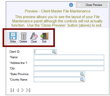
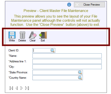
Specify the location of the action buttons (i.e. Write, Delete, Clear, Exit). Define any Additional Buttons to be added before and/or after the action buttons.

If the location is set to "Embedded Panel" and the Position selected is either Top Bar or Bottom Bar, any before/after Action buttons that are added will be ignored when generating the NOMADS panel. In that case, the additional buttons should be added directly to the panel being embedded.

(Location Drop Box)

Click the drop-down arrow for a list of locations.

If selecting a Location that is either identical to or conflicts with the location of the Browse buttons, a message will display, in which case, select a different location.

For additional information, see Browse and Action Buttons in HTML Pages.

Bottom Right

(Default) Buttons are positioned horizontally in the bottom right corner of the main panel.

Bottom Left

Buttons are positioned horizontally in the bottom left corner of the main panel.

Top Right

Buttons are positioned horizontally in the top right corner of the main panel.

Top Left

Buttons are positioned horizontally in the top left corner of the main panel.

Right Side

(Applicable for NOMADS Panels Only)

Buttons are aligned vertically (one below the other) at the right side of the main panel.

Toolbar

Fixed toolbar (i.e. does not stretch) comprised of individual button controls and is positioned at the top left of the main panel.

Example:


If Toolbar is selected for both the Browse and Action buttons, the toolbar will contain browse and action buttons.


Embedded Panel

(Applicable for NOMADS Panels Only)

Select an existing embedded panel to use in place of the standard action buttons (i.e. Write, Delete, Clear, Exit).

The Library and embedded Panel name must be entered or selected; otherwise, a message will display.

Embedded Toolbar

(Applicable for NOMADS Panels Only)

Embedded toolbar that extends horizontally across the top of the main panel and contains embedded button controls.

Example:


If Embedded Toolbar is selected for both the Browse and Action buttons, the embedded toolbar will contain browse and action buttons.


Library

(Applicable for NOMADS Panels Only - Available when action buttons Location is Embedded Panel)

Library path for the existing embedded panel. Click the drop-down arrow for a list of (up to nine) previous library selections.

Click the Browse button to look through the directory structure to find the library or type the library path. An expression can also be entered by preceding the expression with an = (equals sign); e.g. =libname$ or ="mylib.en".

Note:
The Library name may be a specific or generic reference. See Cascading Language Suffixes.

Panel

(Applicable for NOMADS Panels Only - Available when a Library is selected)

Embedded panel name. Click the drop-down arrow for a list of panels in the selected library.

Note:
It is not recommended to embed a generated file maintenance panel into another file maintenance panel to be generated, as this may cause issues when the NOMADS panel or HTML page is displayed.

Position

(Applicable for NOMADS Panels Only - Available when an Embedded Panel Name is selected)

Position of the selected embedded panel on the file maintenance panel. Click the drop-down arrow for a list of positions: Top Left, Top Center, Top Right, Top Bar, Bottom Left, Bottom Center, Bottom Right, Bottom Bar.

Embedding a panel in the Top Bar or Bottom Bar position is similar to embedding it in the Top Left or Bottom Left position except that when Top Bar or Bottom Bar is selected, the Stretchable check box is automatically selected for the embedded panel control on the generated panel. This allows an embedded panel that contains a rectangle shape to be stretched to fill the entire width of the panel, which is useful when creating a Toolbar.

When Top Bar or Bottom Bar is selected, any Additional Buttons that are added before and/or after the Action buttons will be ignored; therefore, any additional buttons that are required should be added directly to the panel being embedded.

Note:
The Position cannot be duplicated if using more than one embedded panel to define the screen layout in Step 3; otherwise, a message will display.

Tab Stops

(Not Available when action buttons Location is Toolbar, Embedded Panel or Embedded Toolbar)

Select this check box to add the action buttons to the panel's tabbing sequence.

Additional Buttons

Button that launches the Maintain Additional Buttons window for adding (and editing) additional buttons that are placed before and/or after the browse and action buttons.

(The Additional Buttons button was added in PxPlus 2022.)

Optional embedded panel

Define the options for adding an embedded panel to the NOMADS panel.

Library

(Applicable for NOMADS Panels Only)

Library path for the existing embedded panel to be added. Click the drop-down arrow for a list of (up to nine) previous library selections.

Click the Browse button to look through the directory structure to find the library or type the library path. An expression can also be entered by preceding the expression with an = (equals sign); e.g. =libname$ or ="mylib.en".

Note:
The Library name may be a specific or generic reference. See Cascading Language Suffixes.

Panel

(Applicable for NOMADS Panels Only - Available when a Library is selected)

Embedded panel name. Click the drop-down arrow for a list of panels in the selected library.

Note:
It is not recommended to embed a generated file maintenance panel into another file maintenance panel to be generated, as this may cause issues when the NOMADS panel or HTML page is displayed.

Position

(Applicable for NOMADS Panels Only - Available when an Embedded Panel Name is selected)

Position of the selected embedded panel on the file maintenance panel. Click the drop-down arrow for a list of positions: Top Left (Default), Top Center, Top Right, Top Bar, Left Edge, Right Edge, Bottom Left, Bottom Center, Bottom Right, Bottom Bar.

Note:
The Position cannot be duplicated if using more than one embedded panel to define the screen layout in Step 3; otherwise, a message will display.

Optional Include HTML page

Specify an HTML page to include on the file maintenance panel to be generated.

(Input field)

(Applicable for HTML Pages Only)

(Optional) Enter the directory and an existing HTML page to include or click the Query button.

(The option to include an HTML page was added in PxPlus 2021.)

Position

(Applicable for HTML Pages Only - Available when an HTML Page is specified)

Position of the HTML page on the file maintenance panel, either Top (Default) or Bottom.

(The Position option was added in PxPlus 2021.)

Webster+ Template

Specify a Webster+ template file.

(Input field)

(Applicable for HTML Pages Only)

Enter the template file name. If no suffix is entered, an .html suffix is added at run time.

(The Webster+ Template option was added in PxPlus 2023 Update 1.)

Browse and Action Buttons in HTML Pages

The browse and action buttons that are used in generated Webster+ HTML pages work a little differently from the way they work in NOMADS panels, as explained below.

The Embedded Panel options for browse and action buttons do not apply to generated HTML pages.

The browse and action buttons are added to the HTML page using the Webster+ [include] short code and one of the following pages located in the *webster/pages directory:

FM_BROWSE.HTML

Standard browse buttons (not in a toolbar)

FM_ACTION.HTML

Standard action buttons (Write, Delete, Clear, Exit)

FM_INQ_ACTION.HTML

Standard action buttons for an inquiry panel (Clear, Exit)

FM_BROWSE_TOOLBAR.HTML

Browse buttons in a toolbar

FM_ACTION_TOOLBAR.HTML

Action buttons in a toolbar

FM_INQ_ACTION_TOOLBAR.HTML

Inquiry panel action buttons in a toolbar

FM_FULL_TOOLBAR.HTML

Browse and action buttons in a toolbar

FM_INQ_FULL_TOOLBAR.HTML

Browse and inquiry panel action buttons in a toolbar


Note:
If custom versions of the browse and action buttons are required, these files may be copied to a location that will be found in the prefix prior to *webster/pages and edited.

Additional Options

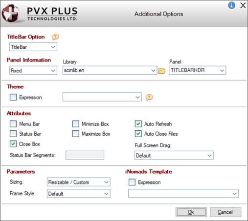
The Additional Options button is available only when creating a NOMADS Panel and launches the Additional Options window with more options for defining the panel header.

These options do not apply to HTML pages.

This window consists of the following:

TitleBar Option

Specify a panel to insert as a title bar at the top of the panel. You can also specify that the default title bar or no title bar will be used.

Click the drop-down arrow for a list of selections:

Default

Use the current default Title Bar setting for the panel based on the %NOMADS'TitleBar$ and Library Defaults settings.

TitleBar

Use the panel defined in the Panel Information section as the title bar for the panel.

None

The panel will not have a title bar.

For information on the use of the Frame Style parameter when creating a custom title bar, see Custom Title Bars.

Panel Information

(Available when the TitleBar Option is TitleBar)

Fixed or Expression

The Custom Title Bar panel information can be entered as a Fixed value or as an Expression:

If Fixed is selected, enter the Library and Panel information.

If Expression is selected, enter an expression that can be evaluated to a value consisting of the panel name and library, separated by a comma (e.g. PanelName,LibraryName).

Library

Library path that contains the Title Bar panel definition. Click the drop-down arrow for a list of recently used libraries. Click the Browse button to look through the directory structure to find the library. Be sure to use the simplest form of the path for your application.

Note:
The Library name may be a specific or generic reference. See Cascading Language Suffixes.

Panel

Name of the panel definition to use as the Title Bar for the panel. Click the drop-down arrow for a list of all panels in the library.

Theme

Assign a Theme to be applied to the panel. The Theme can be defined as a Fixed value or string Expression.

Note:
A Theme applied at the Panel level overrides the General level Theme set in %NOMADS'Theme$ and the Library level Theme assigned in Library Defaults.

A Theme assigned to the %NOMADS'ThemeOverride$ property overrides all other Theme settings. See Applying a Theme to Your Application.

Attributes

Menu Bar

Panel has a Menu Bar.

Status Bar

Panel will be created with a status line/message bar.

Close Box

Enables the Windows close button at the top right corner of the panel.

Status Bar Segments

(Available when Status Bar check box is selected)

Define up to three additional (optional) status bar segments for the current panel by clicking the button next to the input control and entering the starting column number for the segment.

The default segment (0) starts at column 0. Additional segments can be defined with a positive column number to specify the starting column from the left, or a negative column number to specify the start of a segment from the right. Display text in the individual segments using the 'MESSAGE' mnemonic.

Example:

     PRINT 'MESSAGE'(text$,segnum)

Where:

     The first segment number is 0.

If the Status Bar attribute is checked and no segments are defined, the system status bar will be used. If segments are defined for the panel, they will override the system definition.

Note:
Use the 'MESSAGE' mnemonic to define a system status bar.

Minimize Box

Enables the minimize box in the top right corner of the window.

Maximize Box

Enables the maximize box in the top right corner of the panel.

Auto Refresh

The screen display is refreshed automatically when any control values are changed by the application.

Auto Close Files

If enabled, all non-global files opened by the application are closed automatically when the panel terminates.

Full Screen Drag

If selected, a panel can be moved by clicking anywhere on the panel outside of the controls (as well as on the title bar) and dragging the panel to the desired location. This setting overrides the %NOMADS'Full_Screen_Drag property and the Full Screen Drag setting in Library Defaults.

Click the drop-down arrow for a list of selections:

Default

Use the default setting based on the %NOMADS'Full_Screen_Drag property and the Full Screen Drag setting in Library Defaults.

Always on

The panel will always have the Full Screen Drag feature turned On, regardless of default settings.

Always off

The panel will always have the Full Screen Drag feature turned Off, regardless of default settings.

Parameters

Sizing

Determines whether the panel will remain fixed in size or can be resized at run time by dragging the edges of the window. Click the drop-down arrow for a list of selections: Fixed, Resizable, Resizable/Auto Scroll, Resizable/Auto Size, Resizable/Custom.

Note:
To make it possible for users to resize a panel larger than the defined size while still maintaining a minimum panel size, select the Maximize Box attribute and set the Sizing parameter to Resizable/Custom.

Frame Style

Controls the type of frame or border for the current window. Click the drop-down arrow for a list of selections:

Default

Uses current settings. The standard Windows title bar is displayed.

Thick border with caption

Adds a thick border and a caption to the current window. The standard Windows title bar is displayed.

Thick with no caption

Adds a thick border to the current window but no caption. The standard Windows title bar is not displayed.

Thin with no caption

Adds a thin border to the current window but no caption. The standard Windows title bar is not displayed.

No frame or caption

Does not add a border or a caption. The standard Windows title bar is not displayed.

For information on the use of the Frame Style parameter when creating a custom title bar, see Custom Title Bars.

iNomads Template

If specified, the iNomads Template will be applied to the panel, overriding the template specified for the session.

OK

Saves changes and closes the Additional Options window, returning to the Step 3: Screen panel.

Cancel

Does not save changes and closes the Additional Options window, returning to the Step 3: Screen panel.

Maintain Additional Buttons

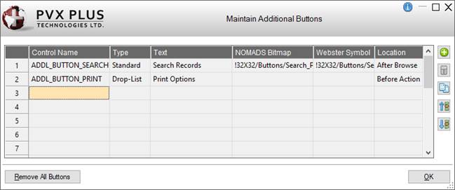
The Maintain Additional Buttons window is launched when the Additional Buttons button is selected. It is used for adding (and editing) the additional buttons to be placed before and/or after the browse and action buttons. Up to 20 additional buttons can be added.

This window consists of the following:

(Additional Buttons Grid)

Displays a list of the additional buttons. After a new additional button is defined, it is automatically added to this list.

Add or Edit an Additional Button

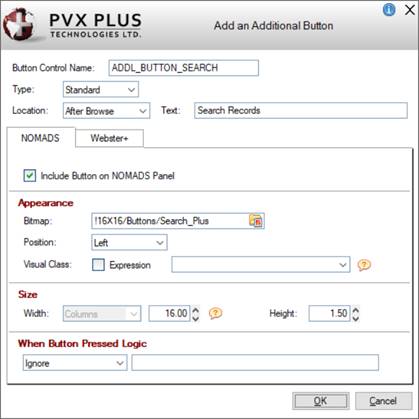
Button that launches the Add an Additional Button window for defining a new additional button and editing an existing one.


Many of these options are also available when adding a Button object on the file maintenance panel in Step 6: Fields (see Button object), except for these differences:

Location

Select the location of the additional Button control: Before Action, After Action, Before Browse, After Browse.

NOMADS


Appearance

Popup Library

(Available when button Type is Drop List)

Library path for the popup menu. Click the drop-down arrow for a list of (up to nine) previous library selections.

Click the Browse button to look through the directory structure to find the library or type the library path. An expression can also be entered by preceding the expression with an = (equals sign); e.g. =libname$ or ="mylib.en".

Note:
The Library name may be a specific or generic reference. See Cascading Language Suffixes.

Popup Panel

(Available when button Type is Drop List)

Popup menu name. Click the drop-down arrow for a list of existing popup menus in the selected library. Click the Popup button to invoke the Menu Bar Definition for the selected popup menu.

A new popup menu can be created on-the-fly. Enter a new Popup Panel name and then click the Popup button to define the menu.

Size

Width
Height

Enter the width (in number of columns only) and the height for the additional Button on the NOMADS panel or use the spinner control.

The width and height of the additional Button will default based on the location selected for the action or browse buttons:

New "browse" buttons default to a width of 3 and a height of 1.5. If the location of the browse buttons is set to Toolbar or Embedded Toolbar, then they will default to a width of 6 and a height of 3.
New "action" buttons default to a width of 10 and a height of 1.5. If the location of the action buttons is set to Toolbar or Embedded Toolbar, then they will default to a width of 6 and a height of 3.

If an actual number of columns has been entered and the Button text is edited so that its length exceeds the number of columns, the value will adjust to match the length of the Button text entered plus 2.

Webster+


Appearance

List Items

(Available when button Type is Drop List)

Grid used for entering the text and the HTML Event to trigger for each item in the drop list.

HTML Class

A single HTML Class can be entered (e.g. bold). Multiple classes can be entered, separated by either spaces or commas. When spaces are used as the delimiter, the values must be within double quotes (e.g. "bold text_red fill_cyan" or bold,text_red,fill_cyan).

See Webster+ Defined Classes.

Three system defined classes are used:

fm_action

Assigned to the action buttons on the system fm_action.html page. Can be defined to change the appearance of the action buttons.

fm_browse

Assigned to the buttons on the system fm_browse.html page. Changes the appearance of buttons located beside a key segment to be borderless and one line high.

fm_toolbar

Assigned to the various system toolbar html pages. Can be defined to change the appearance of toolbar buttons.

Size

Width
Height

Enter the width (in number of columns only) and the height for the additional Button on the Webster+ page or use the spinner control.

In Webster+, the width defaults to Auto. A width of Columns - Auto will result in the Button being just wide enough to accommodate the text (and symbol if present). To set it back to Auto, enter 0. Otherwise, enter the desired value or use the spinner control. Valid entries are 0 to 300.

The height of the additional Button will default based on the location selected for the action or browse buttons:

New "browse" buttons default to a height of 2. If the location of the browse buttons is set to Toolbar or Embedded Toolbar, then they will default to a height of 5. If the location is set to Beside Key, they will default to a height of 1.25.
New "action" buttons default to a height of 2. If the location of the action buttons is set to Toolbar or Embedded Toolbar, then they will default to a height of 5.

If an actual number of columns has been entered and the Button text is edited so that its length exceeds the number of columns, the value will adjust to match the length of the Button text entered plus 2.

Delete an Additional Button

Removes the selected additional Button. Prior to deletion, a message will display.

Copy an Additional Button

Creates a new additional button by copying the settings from an existing button selected in the grid.

(Copy an Additional Button was added in PxPlus 2023.)

Move Up
Move Down

Moves the selected additional Button up or down within the list, changing the order of the additional Buttons on the NOMADS panel and Webster+ page.

Remove All Buttons

(Available when an additional Button is defined)

Removes all the additional Buttons listed in the grid. Prior to deletion, a message will display.

(Remove All Buttons was added in PxPlus 2023.)

(The ability to add/maintain Additional Buttons was added in PxPlus 2022.)

See Also

File Maintenance Generator Steps