|
Control Object Properties |
|
Various properties of Graphical Control Objects in PxPlus (Button, Drop Box, Scrollbar, etc.) can be referenced and modified dynamically using a control's assigned CTL value (ctl_id), followed by the Apostrophe Operator and one of the associated property names.
Below is a list of some commonly used control object properties:
|
|
Column | |
|
|
Line | |
|
|
Width of the control | |
|
|
Height of the control | |
|
|
Tip for the control | |
|
|
Message line for the control | |
|
|
Format mask for the control | |
|
|
Text color | |
|
|
Current value/state of the control |
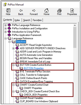
For each graphical control object, a list of properties and their descriptions is included with the Help for the associated control directive. For example, a list of Button Properties is available by expanding the Help node for the BUTTON directive. A list of Chart Properties is available by expanding the Help node for the CHART directive, and so on.
The following links provide information on all the properties that can be used for each control type:
|
|
||||
|
|
||||
|
|
||||
|
|
Properties List
Dynamic Control Properties