PxPlus Releases
|
PxPlus 2024 (version 21.00) |
May 2024 |
PxPlus 2024 includes new features to keep your applications safe, secure and modern:
|
 |
The Harvard Business Review reported a 20% increase in cyber security data breaches from 2022 to 2023. To protect your application and your customers' data, PxPlus 2024 is updated with the latest Security modules. |
|
 |
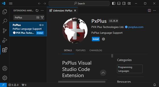
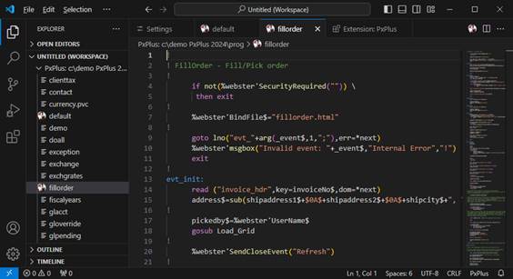
In speaking with the developer community, we learned that many developers are using Visual Studio Code in other areas of their development teams. PxPlus 2024 includes a new extension to Visual Studio Code, an industry-leading code editor that is the preferred choice for many developers. |
|
 |
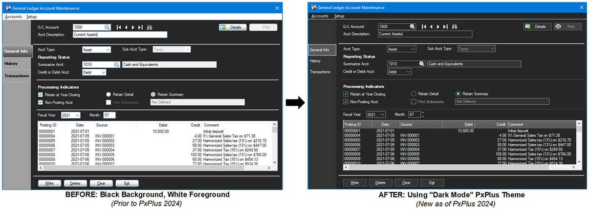
In today's competitive environment, the look and feel of an application is equally important as the functionality. PxPlus 2024 includes modern PxPlus toolkit interfaces showcasing Dark and Light modes, and new tools to update the look of your Nomads and non-Nomads based applications. |
|
 |
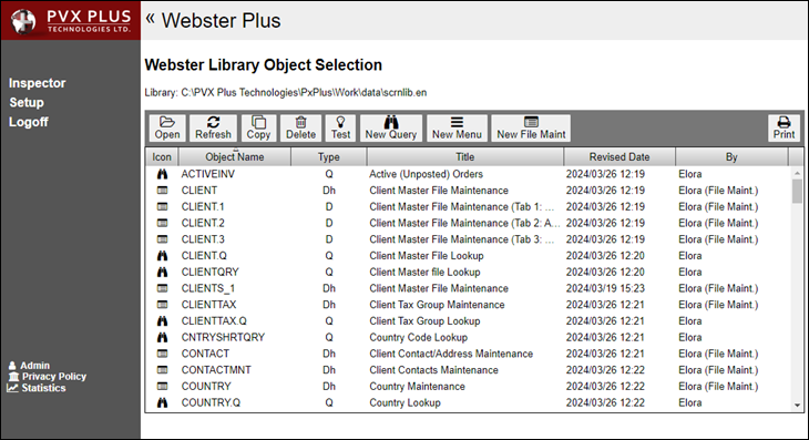
Webster+, launched in 2021, provides developers with the optimal toolset to convert your application to browser based. PxPlus 2024 continues to enhance Webster+ with the ability to create and maintain screen library objects using a Web browser with Webster+ Inspector. |
|
 |
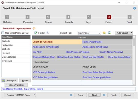
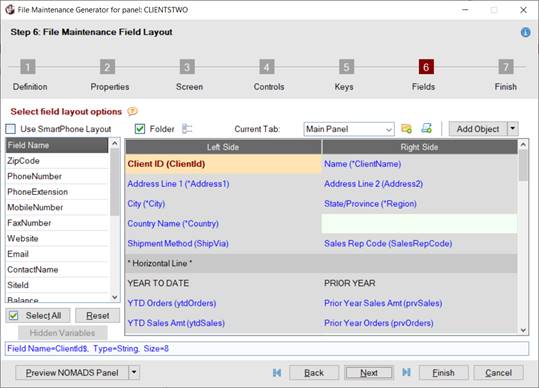
We made it even easier for you to design your application screens for NOMADS and Webster+ with the new File Maintenance Generator Enhanced Layout. |
Major New Features
|

PxPlus Visual Studio Code Extension Install Screen |

Example: PxPlus Program Opened in Visual Studio Code Editor |
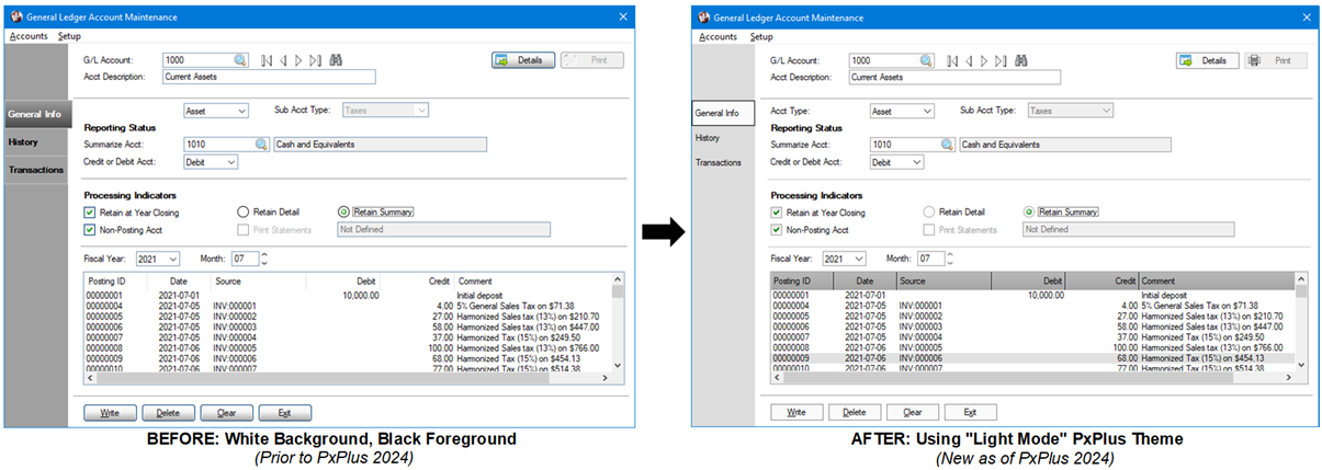
- Introducing Dark and Light mode
Toolkit Themes to enhance the PxPlus Development Suite experience
|

Dark Mode |

Light Mode |
- Updated
Themes and
Visual Classes attributes and Control Properties for greater control of screen object options and colors to enhance the look of applications designed in both the NOMADS and non-NOMADS environments
- New
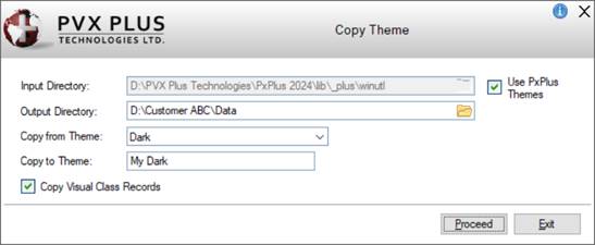
Copy Theme utility makes it easier to copy and create new Themes and Visual Classes across multiple directories
- New PxPlus Dark and Light mode Themes and Visual Classes can also be copied
-
How to Copy a Theme
|

Copy Theme |
- As part of our ongoing commitment to provide more Web development capability, File Maintenance panels, Queries and Menus can now be maintained in a Web browser with
Library Object Selection for Webster+
|

Webster+ Library Object Selection |
- File Maintenance Generator
Enhanced Layout provides greater flexibility for creating Nomads panels and Webster+ HTML pages
|

Enhanced Layout |

Two-Column Layout |
Enhancements
Language Changes
-
FRAME mnemonic enhanced with optional arguments for specifying the Frame Text, Highlight and Shadow colors
Directives
-
DEF ENV directive for adding, changing or deleting environment variables from the current process and any subsequent spawned process
- Added HFILL, HTEXT and TEXT parameters to the
MENU_BAR directive for specifying hover background color, hover text color and menu text color
- Option added to the
MENU_BAR directive to control colors applied to the top level menu
- New "I" option added to
BUTTON directive for creating a spinner button
OPTION Mnemonics
-
DrpBtnBackClr option for setting the background color of the Drop Box button
-
DrpBtnDisableBackClr option for setting the background color of the Drop Box button when the Drop Box is disabled
-
DrpBtnHoverBackClr option for setting the background color of the Drop Box button while hovering over it
-
DrpBtnHoverTickClr option for setting the color of the down arrow/tick on the Drop Box button while hovering over it
-
DrpBtnTickClr option for setting the color of the down arrow/tick on the Drop Box button
Note: The above options can be read using the FIN( ) function.
Parameters
-
'TI' system parameter controls whether the system will use the transparent PNG versions of the internal images (defaults to On) or the legacy bitmap internal images
- Increased the default memory limit for the
'SZ' system parameter from 32MB to 64MB to reflect current requirements
Properties
Properties can be used to specify settings for Nomads and non-Nomads applications.
Note: To use the new properties, 4D mode is required.
- Check Box properties added:
-
CbFrameColor$ property for setting the color of the check box frame only for Check Boxes with no bitmap defined
-
CbHoverColor$ property for setting the color of the hover rectangle in the check box only for Check Boxes with no bitmap defined
-
CbMarkColor$ property for setting the color of the check mark in the check box only for Check Boxes with no bitmap defined
- Drop Box properties added:
-
ButtonBackColor$ property for setting the background color of the Drop Box button
-
ButtonDisableBackColor$ property for setting the background color of the Drop Box button when the control is disabled
-
ButtonHoverBackColor$ property for setting the background color of the Drop Box button while hovering over it
-
ButtonHoverTickColor$ property for setting the color of the down arrow/tick on the Drop Box button while hovering over it
-
ButtonTickColor$ property for setting the color of the down arrow/tick on the Drop Box button
- Grid properties added:
-
CurrentCellTextColor$ property for setting the text color for the current cell
-
ForegroundButtonColor$ property for setting the foreground text color for system-generated buttons in a Grid
-
LockBackColor$ property for setting the background color when the Grid cell is locked
-
LockTextColor$ property for setting the foreground text color when the Grid cell is locked
-
RowHeaderBackColor$ property for setting the background color for the leading left column only of the Grid and does not affect the top row
-
RowHeaderTextColor$ property for setting the text color for the leading left column only of the Grid and does not affect the top row
- Multi-Line properties added:
- Radio Button properties added:
-
RbFrameColor$ property for setting the color of the radio button frame only for Radio buttons with no bitmap defined
-
RbHoverColor$ property for setting the color of the hover circle in the radio button only for Radio buttons with no bitmap defined
-
RbMarkColor$ property for setting the color of the circle in the radio button only for Radio buttons with no bitmap defined
- Other Properties added (used by multiple controls):
-
FrameColor$ property for setting the color of the frame/border around Drop Boxes, Variable Drop Boxes, Multi-Lines, and all List Box controls
-
GrayDisabledBmp property for controlling how images will display on disabled Buttons, Check Boxes, Tri-State Check Boxes and Radio Buttons with images
Folder Objects
Webster+
- Enhanced the
[addcalc] short code to provide the sum of a column from a List Box
-
[report] short code added to insert a report as HTML into the page based on the report name and optional parameters provided
- Added
Library Object Selection, which includes options for creating file maintenance panels, queries and menus
- Added Webster+ method
GetiNomadsEmbedURL$ to return a URL that will display the given iNomads URL embedded in a Webster+ page
- Webster+
Queries:
- Query data can be printed to a PDF or downloaded to a .CSV file
- Column Header Tip capability
Visual Studio Code Extension
The
Visual Studio Code Extension is a PxPlus extension for maintaining PxPlus programs in Visual Studio Code.
- Create and edit PxPlus and PxPlus text-based programs
- PxPlus syntax highlighting and error diagnostics
- Document-based Auto Complete
- Settings:
- Specify file extension for text-based PxPlus programs
- Manage display preferences for Lowercase Directives, Lowercase Variables, Mixed Case Variables and Suppress LET Directives
Enhanced IDE, Nomads and Toolkit
- Ability to apply a PxPlus
Toolkit Theme (Dark mode, Light mode) to the development toolkit in System Defaults
- Ability to select a predefined PxPlus Toolkit Theme in
Library Defaults,
Panel Header and as the general Theme for your application
- New
Copy Theme utility for copying existing Themes or predefined PxPlus Themes and related Visual Classes
- Visual effects Display option in
System Defaults and
Library Defaults will default to 4D if not previously set
- Ability to assign a Visual Class to Circle, Line and Rectangle
Shapes
-
Do Not Extend Tab Width When Active option for sidebar Folders allows the active tab width to remain the same width as inactive tabs
-
Dynamic Text attribute can be set that will control the text shown on the Button by using the string variable name associated with the Button
-
Online Help link added to the IDE menu bar for launching the PxPlus Help documentation
- New Grid Presets:
-
CurrentCellTextColor$ property for setting the text color for the current cell
-
ForegroundButtonColor$ property for setting the foreground text color for system-generated buttons in a Grid
-
LockBackColor$ property for setting the background color when the Grid cell is locked
-
LockTextColor$ property for setting the foreground text color when the Grid cell is locked
-
RowHeaderBackColor$ property for setting the background color for the leading left column only of the Grid and does not affect the top row
-
RowHeaderTextColor$ property for setting the text color for the leading left column only of the Grid and does not affect the top row
-
Menu Bars and
Popup Menus - Define Menu Colors enhancements:
- New Menu Color option for Text
- Option to apply a Top Menu color (Menu Bar)
- Ability to assign a Visual Class
-
Spinner Button option added for creating a Button control
-
TextColor$ property can now be set for Plus, RGraph and Google Charts
- New Customize button for selecting the columns to display in the Search list box in the
Library Bulk Edit and Search and
File View/File Update utilities
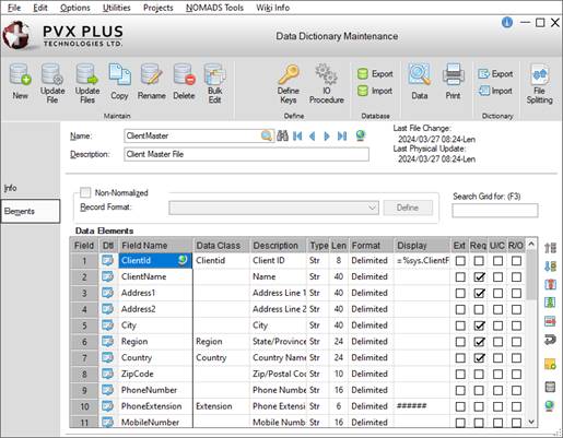
File Maintenance Generator
-
Enhanced Layout added that allows rows in the panel layout to be formatted as true Full, Half, Third or Quarter Sections and maintains these sections when generating Nomads panels and Webster+ HTML pages
-
Layout option added for selecting either the Enhanced Layout or Two-Column Layout when defining a new file maintenance panel
Themes and Visual Classes
Use
Themes and
Visual Classes for defining a new look for your application, similar to the Dark and Light modes in the PxPlus Toolkit. Themes are applied to all similar controls across the application, whereas Visual Classes are used for specific controls. Copy Themes and Visual Classes by using the
Copy Theme utility.
- New
Menu Bar and
Popup Menu Control Type properties:
- Use Color on Top Level property controls the Text and Background menu colors applied to the top level of the menu bar (Not applicable for Popup Menu)
- Menu Background Color property controls the background color applied to the menu
- Menu Left Edge Color property controls the background color applied to the left edge portion of the menu
- Menu Text Color property controls the text color applied to the menu items
- Hover Background Color property controls the color used for the background when hovering over an item
- Hover Text Color property controls the color of the menu item text when the mouse hovers over it
- New
Shape-Circle,
Shape-Line and
Shape-Rectangle Control Type properties:
- Fill Pattern property controls the direction of the gradient fill or pattern (Not applicable for Shape-Line)
- Fill Color 1 property sets the starting color for the shape if a Fill Pattern is selected (Not applicable for Shape-Line)
- Fill Color 2 property sets the second color for the two-color gradient or fill pattern if a Fill Pattern is selected (Not applicable for Shape-Line)
- Pen Style property sets the pen style
- Pen Width property sets the pen width if a Pen Style is selected
- Pen Color property sets the pen color if a Pen Style is selected
- iNomads Class property is used to assign an iNomads class to the control
- Button properties added:
-
Gray Disabled Bitmap property defines how the control displays images when disabled (when bitmap added)
- Check Box properties added:
-
Check Box Frame Color property controls the color of the frame/box of the Check Box (when no bitmap added)
-
Check Box Hover Color property controls the color of the hover rectangle in the Check Box when the mouse is over the control (when no bitmap added)
-
Check Box Mark Color property controls the color of the check mark in the Check Box (when no bitmap added)
-
Gray Disabled Bitmap property defines how the control displays images when disabled (when bitmap added)
- Drop Box properties added:
-
Button Background Color property controls the background color for the button on a Drop Box
-
Button Hover Color property controls the background color for the button on a Drop Box while hovering
-
Button Tick Color property controls the color of the down arrow/tick on the button on a Drop Box
-
Button Tick Hover Color property controls the color of the down arrow/tick on the button of a Drop Box while hovering
-
Disable Btn Background Color property controls the background color of the Drop Box button when the control is disabled
-
Frame Color property controls the color of the frame/border around the control
- Folder properties added:
- Frame properties added:
-
Hilight Color property controls the color of the highlight line for non-Text Mode frame styles
-
Shadow Color property controls the color of the shadow line for non-Text Mode frame styles
- Grid properties added:
-
Current Cell Text Color property controls the text color for the currently selected Grid cell
-
Foreground Button Color property controls the foreground text color for system-generated buttons in a Grid, including drop box buttons and query buttons
-
Lock Background Color property controls the background color when the Grid cell is locked
-
Lock Text Color property controls the foreground text color when the Grid cell is locked
-
Row Header Background Color property sets the background color for the leading left column only and does not affect the top row
-
Row Header Text Color property sets the color of the text for the leading left column only and does not affect the top row
-
Row Height property can also be set to -1 to use the default row height for the Grid
- List Box properties added:
-
Frame Color property controls the color of the frame/border around the List Box or Variable List Box
-
Lines Per Row property can also be set to -1 to use the default lines per row for the List Box
- Multi-Line properties added:
-
Frame Color property controls the color of the frame/border around the control
-
Lock Background Color property controls the background color when the control is locked
-
Lock Text Colorproperty controls the foreground text color when the control is locked
-
Spinner Button Display properties control the appearance of the spinner button:
▪ Spinner Arrow Color property controls the color of the chevrons in a spinner button
▪ Spinner Background Color property controls the color of the background of a spinner button
▪ Spinner Button Attributes property presents a list of display attributes for setting the appearance of the spinner button
▪ Spinner Hover Color property controls the color of the chevron when hovering over it in the spinner button
- Radio Button properties added:
-
Gray Disabled Bitmap property defines how the control displays images when disabled (when bitmap added)
-
Radio Button Frame Color property controls the color of the frame/outline circle of the Radio Button (when no bitmap added)
-
Radio Button Hover Color property controls the color of the hover circle in the Radio Button when the mouse is over the control (when no bitmap added)
-
Radio Button Mark Color property controls the color of the circle in the Radio Button (when no bitmap added)
- Tri-State Check Box properties added:
-
Check Box Frame Color property controls the color of the frame/box of the Check Box (when no bitmap added)
-
Check Box Hover Color property controls the color of the hover rectangle in the Check Box when the mouse is over the control (when no bitmap added)
-
Check Box Mark Color property controls the color of the check mark in the Check Box (when no bitmap added)
-
Gray Disabled Bitmap property defines how the control displays images when disabled (when bitmap added)
- Variable Drop Box properties added:
-
Button Background Color property controls the background color for the button on a Drop Box
-
Button Hover Color property controls the background color for the button on a Drop Box while hovering
-
Button Tick Color property controls the color of the down arrow/tick on the button on a Drop Box
-
Button Tick Hover Color property controls the color of the down arrow/tick on the button of a Drop Box while hovering
-
Disable Btn Background Color property controls the background color of the Drop Box button when the control is disabled
-
Frame Color property controls the color of the frame/border around the control
- Variable List Box properties added:
-
Frame Color property controls the color of the frame/border around the control
Query Changes
-
Columns list for a new query will be automatically populated with the primary key(s) and the next non-key field with a length >=15 if the main file has a defined data dictionary
Security
Utilities and Commands
-
*TOOLS/QRYEXPORT utility creates an export file (.csv, .slk, .txt or .xml) based on a query definition
-
*TOOLS/QRYPRINT utility prints a PDF report based on a query definition
-
OLHELP command launches the online PxPlus Help manual in a Web browser
- Added support for "clickatell", "seven" and "vonage" (formerly "nexmo") SMS services to
*TOOLS/SMS utility
PxPlus SQL ODBC Driver/SQL Server (Version 8.00.0000)
PxServer
- Added a Browse button beside appropriate input fields for easier file or directory selection
Other Changes for Reference
Nomads Properties
![]()
![]()
![]()
![]()
![]()
